COC#4: On-Chain Silence Before The Storm
Low on-chain activity raises questions regarding current investor demand for bitcoin, but patient investors are increasingly accumulating.
September 1, 2021
Cycling On-Chain (COC) is a monthly column that uses on-chain and price-related data to better understand recent market movements and estimate where we are in bitcoin’s market cycle. This fourth edition briefly reflects on the recovering hash rate and then takes a more in-depth look at the relatively low on-chain transfer activity on Bitcoin. After introducing several contributing factors, we discuss to what extent low on-chain activity is reflective of market demand for bitcoin (the asset) or whether monitoring HODLing behavior is actually more useful in the context of bitcoin’s value proposition.
Two months ago, in COC #2 (July 1, 2021), we pointed out two important factors that needed a bit of time to settle, before potentially creating a favorable situation for Bitcoin from a fundamental perspective later this summer — which is now starting to unfold. One was the El Salvador government making bitcoin a legal tender in their country, which is now set to go into effect next week (September 7, 2021).
The other was the major crackdowns on bitcoin by the Chinese government, driving miners out of their country, potentially actually improving the geological distribution of bitcoin mining activity that was heavily concentrated in China up to that point. Some feared a hostile takeover (a 51% attack) of the network by the Chinese government, which has not happened (yet?).
Hash Rate Recovery
After reaching a low of 89 TH/s on July 9, 2021, the two-week moving average of Bitcoin’s hash rate has already recovered to 127 TH/s (+43%) since then, as Bitcoin’s difficulty needed to be increased three times in a row to account for the new hash rate. It is unknown to what extent this hash rate is miners that relocated from China or actual new miners, but it is a positive sign either way. Figure 1 displays the bitcoin price (black) and difficulty (green), as well as the 14-day moving average of its hash rate (red) and number of blocks mined (purple).

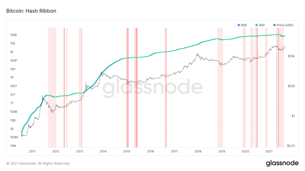
After the massive drop in Bitcoin’s hash rate during May and June, the hash ribbon indicator signaled severe miner capitulation. Now that the hash rate is recovering, figure 2 shows that the 30-day moving average of Bitcoin’s hash rate (green) has crossed the 60-day moving average (blue) to the upside. This bullish crossover on the hash ribbon indicator is interpreted as a buy signal, as this type of hash rate recovery after miner capitulation has historically preceded subsequent price increases.
Block Space Galore
One implication of the rapidly rising hash rate during this recovery period is that many more blocks are being created than normally would be. After all, Bitcoin’s difficulty adjustment mechanism adjusts every 2,016 blocks (~two weeks), but if hash rate rises steeply throughout that period, Bitcoin block creation is like a runaway train. Logically, when more blocks are created, it means that there is more block space available to include transactions.
Besides this actual (temporary) increase in available block space, the adoption of several Bitcoin technologies that optimize block space usage (so effectively, scaling) means that every bit of block space is also starting to be used more efficiently. One example of this is transaction batching, where exchanges combine many transactions into one, limiting their claim on Bitcoin block space and thus also their own transaction fees.
Another example is Segwit adoption, which saw a large increase recently (figure 3). Segwit transactions segregate the signature data from bitcoin transactions, which effectively allows more transactions to be included within each block.
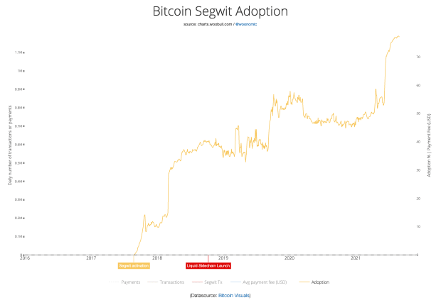
This recent surge is the result of Blockchain.com, a semi-custodial wallet and exchange platform that is under scrutiny within parts of the Bitcoin community, finally upgrading its software — four years after Segwit became available. Since Blockchain.com is estimated to account for ~33% of the bitcoin transactions, this action effectively takes away a large chunk of the market demand for Bitcoin block space, leaving more room for everyone else. (Fun fact: This also means that Blockchain.com has been overpaying for transaction fees for nearly four years, effectively subsidizing bitcoin miners all this time.)
Lightning Network Adoption
When it comes to optimizing the number of real-world transactions that can be fitted into a Bitcoin block, Layer 2 technologies like the Lightning Network are much more promising than any existing on-chain scaling solution. By using a smart-contract-like solution on Bitcoin, the Lightning Network allows users to open up a payment channel and send an infinite number of transactions (within the limitations of the available funds off course), limiting the used block space of all those transactions to just two on-chain transactions to open and later close the channel.
As can be seen in figure 4, Lightning Network adoption is absolutely soaring right now, as for example the number of public nodes, the number of public channels and the value within those channels are going parabolic. The Lightning Network is going to play an important role in El Salvador’s bitcoin adoption as well, which means that this Lightning Network adoption will likely continue to grow in the upcoming years.

Finally, it should be pointed out that other Layer 2 technologies than Lightning exist. An example is Blockstream’s Liquid Network, but to some extent custodial solutions like those of large players like Square, PayPal and Visa that (plan to) allow their users to make BTC-denominated transactions. Skeptics would rightfully point out that using a custodial solution is not using bitcoin but a bitcoin IOU, but the existence of these services impacts the demand for Bitcoin block space nonetheless within the context that we’re discussing here.
Cooled Down Block Space Market
As a result of the hash rate recovery and lowered block space demand due to the recently increased adoption of Segwit and the Lightning Network, the supply of available block space has increased. At the same time, the bitcoin market saw a large price downturn that scared away a lot of speculators, also lowering the demand for block space as there are less entities looking to transact on-chain. During this period, the Bitcoin mempool (the queue of transactions that are waiting to be confirmed) has gotten a chance to clear — and has stayed nearly empty over the last couple of weeks (figure 5).
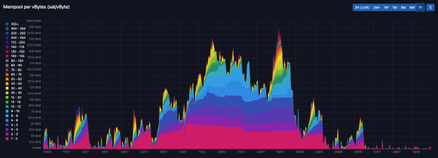
As with any market, a supply shock where an increase in the market-available supply is combined with a decrease in market demand, prices drop. This also applies to the Bitcoin block space market, where transaction fees have recently dropped to levels that are even below those of the 2018–2019 bear market (figure 6). This figure, therefore, also shows that it is not just demand for block space being lower after the price drop that caused the on-chain silence, as surely there are more entities looking to transact now than at the depth of that previous bear market.
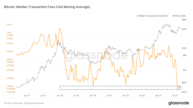
This chain of events is quite unique in Bitcoin’s history, both fundamentally, in terms of actual scaling solutions being adopted, and in terms of the divergence between the trends in the bitcoin price, and Bitcoin’s underlying on-chain activity.
The low transaction fees are concerning to some, as Bitcoin’s long-term security model depends on transaction fees overtaking the block subsidy as the primary source of miner revenue. Although I agree with that statement, I do believe that we have a lot more time to find an appropriate equilibrium in Bitcoin’s block space market.
Mining Is Still (Very) Profitable
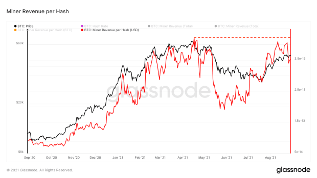
A short-term example for this is that the current (USD-denominated) miner revenue per hash is already close to the yearly highs again (figure 7). China’s hard crackdowns were painful for Chinese miners, but thanks to Bitcoin’s ingenious incentive structure, their pain was actually someone else’s gain. Thanks to the actions by the Chinese government in combination with the global chip shortages that are limiting opportunities of competing mining operations to come online, bitcoin mining is actually very profitable right now — despite only ~1.3% of their current revenue coming from transaction fees.
When it comes to Bitcoin’s long-term security guarantees, we should zoom out, as the adoption of bitcoin (the asset), Bitcoin (the system) and related technologies such as the Lightning Network guarantee volatile times in bitcoin-related markets — both for the bitcoin market and the Bitcoin block space market.
Low Demand For Block Space Does Not Equal Low Demand For Bitcoin
When on-chain activity increases a lot within a short timeframe, it means that there is a clear increase in the demand to move bitcoin around on-chain. Since part of that demand could come from investors looking to buy or sell their position, such spikes could certainly be related to short-term price volatility, including increased demand for bitcoin.
However, the opposite is not necessarily true. As shown in figures 3 through 6, a decrease in on-chain transfer volume can also be the result of scaling technologies. To further support this claim, figure 8 shows that the total bitcoin transfer volume per entity on the network has been in a steady decline ever since Bitcoin’s infrastructure has seen significant maturation improvements (introduction of futures markets and many new exchanges, Segwit, Lightning, Liquid, etc.).
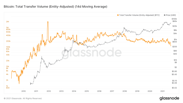
The significance of this trend for the interpretation of transaction-related, on-chain metrics should not be understated. A popular example of this is the Network Value to Transactions (NVT) ratio that we’ll take a closer look at.
How Bitcoin Scaling Is Skewing The NVT Ratio
The Bitcoin NVT ratio was introduced by Willy Woo in February 2017 as a Bitcoin-alternative to the price-per-earnings (PE) ratio that is used in (value) stock investing. By introducing the NVT ratio, Woo not only introduced an interesting new metric but essentially started the on-chain analysis sector that has become very popular since then. The NVT ratio is calculated by dividing Bitcoin’s market cap by its daily transfer volume (USD) and is displayed in figure 9.
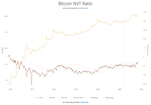
As was already discussed, since the introduction of this metric, a number of scaling solutions have been adopted that are lowering the amount of on-chain transfers per entity, and thus the “T” part of the NVT ratio. Figure 10 displays a 365-day moving average of the entity-adjusted transfer volume that we introduced in figure 8 (green), as well as the 365-day moving average of the NVT ratio (orange).

Figure 10 also shows that since early 2013, the NVT ratio has been in a general uptrend, with a temporary decrease during the 2016–2017 bull market, where the NVT ratio decreased as Bitcoin’s on-chain transaction volume outpaced its market cap growth. During the 2020–2021 bull market, such a temporary decline did not happen, as the adoption of scaling technologies limited the on-chain footprint of the recent influx of new investors.
Under the assumptions that the adoption of the Lightning Network and infrastructure that has a similar impact in limiting the on-chain footprint per transaction will continue and the bitcoin price also keeps increasing, the NVT ratio can be expected to keep trending up over time.
In theory, the NVT ratio can still be a relevant metric to assess more short-term changes in the ratio between bitcoin market valuation and transaction volume, but within that context it is only stable on timeframes where the adoption of scaling technologies is also stable. Either way, analysts should be careful to still use the NVT ratio within the context of more long-term bitcoin price valuation strategies.
Does ‘Using’ Bitcoin Mean Transacting Or HODLing?
On a more philosophical level, one can also wonder if a ratio of the total bitcoin market valuation and its transaction volume is actually the right metric to look at within the context of Bitcoin’s overarching value proposition. Historically, there are two schools of thought regarding Bitcoin’s ultimate use case.
The first one considers Bitcoin to primarily be a censorship-resistant medium of exchange, and thus for transacting bitcoin to indeed be its ultimate use case. Within that frame of mind, the idea behind the NVT ratio indeed is quite reflective of Bitcoin’s relative valuation compared to its ultimate use case.
The second school of thought considers Bitcoin to primarily be a store of value — a dilution-proof money that is designed to maintain its purchasing power over time. Within that frame of mind, HODLing bitcoin is its ultimate use case, whereas transacting it is more of an occasional (yet still essential) functionality. Within that mindset, it is not transaction volume but investor time preference and hardiness to hold onto the asset that are central in its value proposition.
Looking at Bitcoin from that perspective, current “usage” does not look bleak at all.
HODLing Is On The Rise Again
Figure 11 displays the long-term holder (LTH) and short-term holder (STH) supply as a percentage of the circulating bitcoin supply. In this figure, any existing bitcoin is quantified as LTH supply when it has not moved on the blockchain in 155 days or more (~five months).
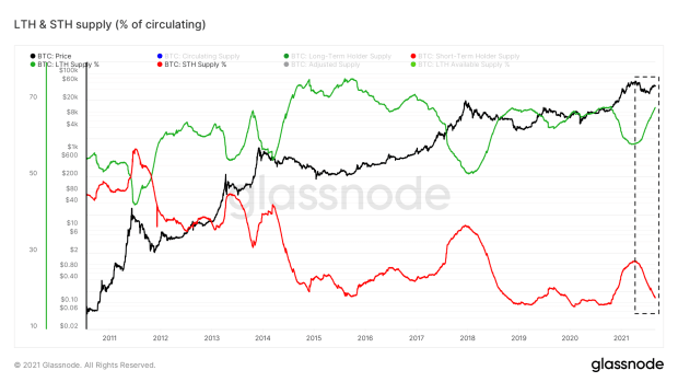
The supply that is in the hands of long-term holders has been fairly constant at around 50–75% of the total supply (excluding bitcoin that is estimated to be lost). The percentage of STH supply has been on a downtrend since bitcoin first received a market price, but temporarily increases during euphoric market conditions that attract new investors.
During the 2020–2021 bull market we also witnessed a clear decrease in LTH supply and increase in STH supply, which has almost completely retraced to pre-bull-market levels. This re-accumulation of bitcoin by long-term holders is, in itself, not necessarily a short-term signal for a market turnaround but has historically shown to often coincide with price levels that end up forming a price floor.
Using coin-aging as a mechanism to estimate HODLing behavior is useful but leans on some assumptions that make it a somewhat broad estimation. Due to the transparent nature of the Bitcoin blockchain, it is (unfortunately, from a privacy perspective) possible to track the actual on-chain flows and identify certain groups of addresses that belong to the same entity. By doing so, it is possible to estimate how much percent of the total bitcoin supply is not on exchanges (figure 12, blue) and how much percent of the total bitcoin supply is in the hands of illiquid entities that have no history of selling (figure 12, green). (For advice on how to improve your own Bitcoin-related privacy and limit your own on-chain traceability, make sure to check out @BitcoinQ_A’s awesome “Bitcoin Privacy Guide.”)
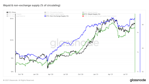
Figure 12 clearly shows that during the market sell-off in May 2021, a good chunk of previously illiquid supply suddenly became liquid again (drop in green line) and that coins that were previously not on exchanges were sent there (drop in blue line). However, both trends have already retraced close to their pre-sell-off levels. This shows that the bitcoin that was dumped on the market during market uncertainty have likely already been re-accumulated into the hands of investors that are less likely to be shaken out of their positions.
Overall market demand for bitcoin is likely not as high as it was during the euphoric times that we saw at the start of the year. However, the bitcoin market appears to be in a state where if something sparks new bitcoin demand, the relatively low amount of market-available supply means that it could spark a rapid price increase (supply shock).
On the flipside, if something does trigger a significant portion of these long-term holders with a relatively illiquid market behavior history to sell their coins, the bitcoin price could rapidly move down as well. Monitoring these metrics is, therefore, necessary to pick up possible trend changes that could signal a market turnaround.
Signs Of A Cooled Down Bitcoin Market
The market downturn over the last few months has given the bitcoin price a chance to significantly cool down on a relative basis. One metric that gives a rather direct estimate of this is the Bitcoin Price Temperature (BPT), which compares the current bitcoin price to its four-year moving average (figure 13, blue line). Price temperatures of two (green), six (orange) and eight (red) have historically signaled possible market turnarounds. At the start of the year, the price bounced off the BPT6 band multiple times before retracing. The current BPT is just above two, despite being at similar price levels to the much higher temperatures that we saw at the start of the year, illustrating how the bitcoin price has cooled off on a relative basis compared to its own four-year market cycle.

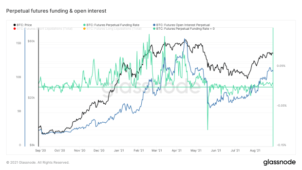
A similar conclusion can be drawn when looking at the funding rates in perpetual bitcoin futures. These funding rates can be seen as a general proxy for the extent in which futures markets are long (funding >0) or short (funding <0). Figure 14 shows that, during the recent market downturn, funding rates went from extremely positive to extremely negative, illustrating a clear shift in market sentiment. The recent local bottom funding rates have turned slightly positive again, but they are very modest in comparison to what we saw around the start of the year, suggesting that the speculative markets are not as overextended as they were back then.
Whales Are Liking The Discount
This recent re-accumulation period appears to be particularly attractive for relatively large market players (whales). Figure 15 visualizes the bitcoin price, overlayed by blue bubbles that represent large (1,00010,000 BTC) bitcoin addresses that saw capital inflows at those price levels.

Two things stand out in figure 15: (1) the 2020–2021 cycle has more large wallet (1,000–10,000 BTC) inflows than the peak of the 2017 cycle, and (2) inflows during the recent price bounce over the last month have been fairly high in comparison to the rest of this cycle.
Current Market Sentiment
I hold a monthly bitcoin market sentiment poll on Twitter. Although the results of such polls always need to be interpreted with a grain of salt due to possible selection bias, this month’s poll suggests that (a portion of) the market still has high expectations for the bitcoin price development over the upcoming year (figure 16).

Halving Cycle Roadmap
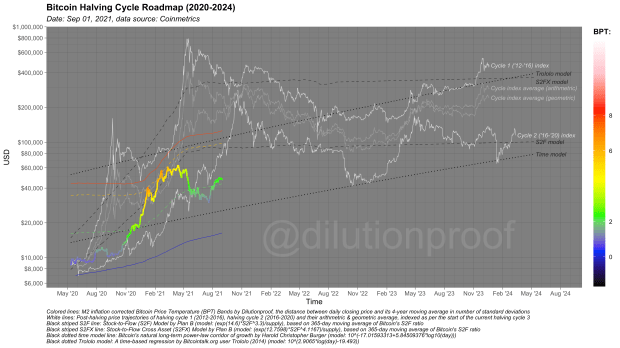
As always, I like to close off this edition of Cycling On-Chain by looking at the Bitcoin Halving Cycle Roadmap for 2020–2024 (figure 17). This chart visualizes the current bitcoin price, overlayed by the BPT that we discussed above and with price extrapolations based on two time-based models (dotted black lines), the stock-to-flow (S2F) and stock-to-flow cross asset (S2FX) model (striped black lines) and cycle indexes for cycles 1 and 2 (white lines) and the geometric and arithmetic averages of those (gray lines). All these models have their own statistical limitations, but together they give us a rough estimate of what may be ahead for the bitcoin price if history does turn out to rhyme once again.
Previous editions of Cycling On-Chain:
- #1 Unwinding Leverage (June 1, 2021)
- #2 Bitcoin Enters Geopolitics (July 1, 2021)
- #3 Squeezed Supply, Shorts and Bitcoin Lemonade (August 1, 2021)
Disclaimer: This column was written for educational, informational and entertainment purposes only and should not be taken as investment advice.
This is a guest post by Dilution-proof. Opinions expressed are entirely their own and do not necessarily reflect those of BTC, Inc. or Bitcoin Magazine.


