Bitcoin Whales Use a Lot Less BTC to Move Markets in 2021 Compared to 2017, Here’s Why (Analysis)
The following on-chain analysis is looking into a significant change of behavior between the bitcoin price in this ongoing 2021 cycle compared to the 2017 cycle.
Accumulating and Distributing
In general, there is a different generation of whales/big players in the current cycle, also commonly referred to as smart Money, that follows different accumulating and distributing patterns.
The process here has two phases:
- Accumulation: when experienced stakeholders are BUYING at a discounted price (usually because of fear, uncertainty, and doubt (FUD) among newcomers)
- Distribution: when the sophisticated market makers are SELLING back to new investors at an inflated price.
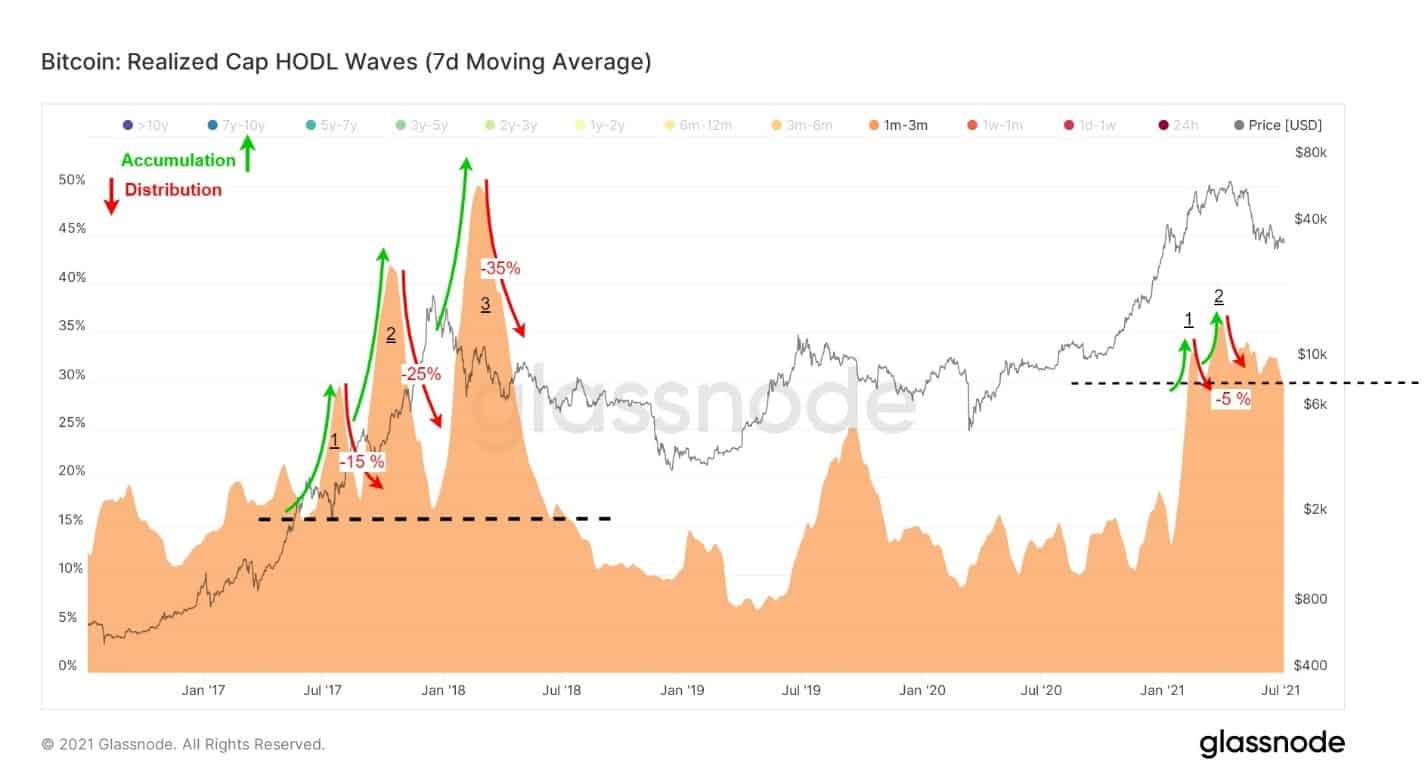
Looking at the behavior of these players back in 2017, we can see they repeated the accumulating and distributing patterns using 15 – 35% of supply (total circulating bitcoins in the market at the time) in three waves – as seen in the following chart.

2017 Vs. 2021: What’s Different and Why?
Interestingly and unlike the 2017 cycle, in the current 2021 bull-run, the same players (most likely institutional-level investors) are not distributing more than 5% of what they accumulated at discounted prices, as can be seen on the chart above.
In fact, they are keeping around 30% of the total supply in their possession despite the recent market crash, which started after bitcoin’s price recorded its ATH in mid-April 2021, at almost $65K. As of writing these lines, BTC’s price lost around 50% of its all-time high value.
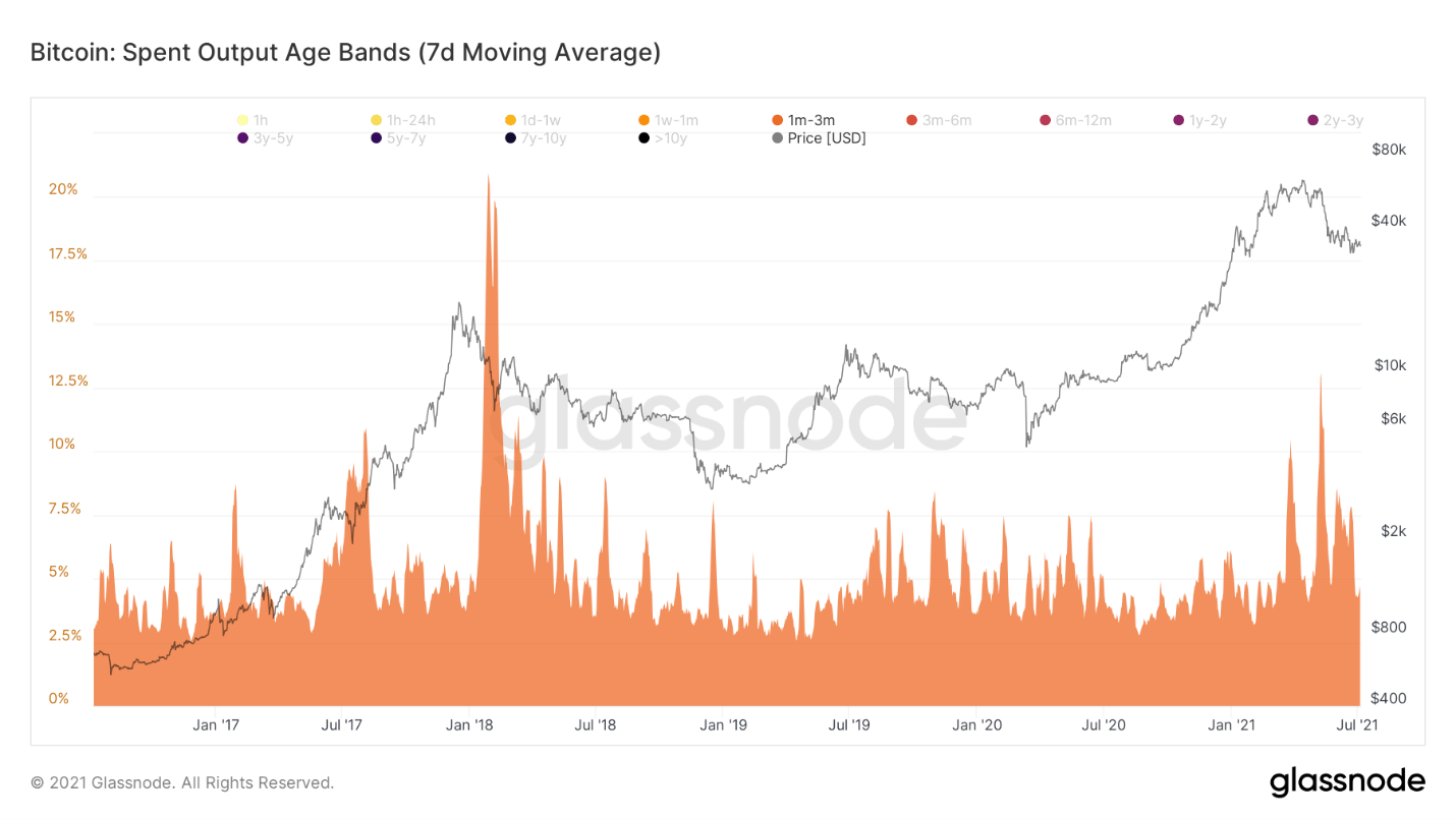
This conservative spending (distribution) is also apparent in the Spent Output Age Band chart, as can be seen in the following chart. The metric shows what percentage of the total coins have been held for a specified time range (shown here between 1-3 months).

When there is a peak in the chart metrics, it means that these coins have been transferred (or spent) more than usual. As can be seen in the above chart, the activity level attributed to this kind of bitcoin whales during local tops has significantly decreased in the current cycle, compared to 2017.
One possible explanation for the above variation might be due to the futures markets and higher stablecoins availability, which allow smart money to leverage a large amount of money, using a small portion of their BTCs as collateral to maneuver the market.
The above analysis is compiled by on-chain analyst CryptoVizArt for CryptoPotato.


