After A Needed Break, The Bitcoin Price Still Has Gas In The Tank
What’s been behind the recent dips in the price of bitcoin, and what might the future potentially hold?
Navigating the stormy seas of the bitcoin markets can be a challenge. Luckily, Bitcoin uses a publicly available blockchain that contains valuable information about all transactions that were ever made on the network. By combining this on-chain data with other price and market data, bitcoin holders are more equipped to understand why its markets behave the way that they do, giving them tools to make more informed decisions or the confidence needed to keep sailing. This article is the fifth installment in a series of monthly market analyses that started out as a Twitter thread that was transformed into this article upon request.
This bitcoin market analysis looks at three overarching questions:
- Why did we dip (again)?
- Is there still demand?
- Is there still room for growth?
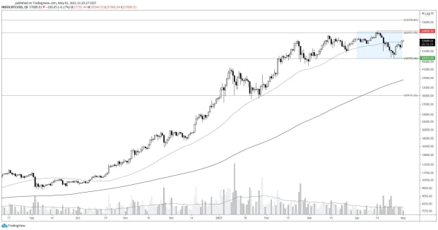
Before we dive into those questions, let’s first have a look at the price chart (figure 1). Bitcoin started the month strong, rallying to a new all-time high at ~$69,000 but then dropped to ~$47,000 (-27.56%), where it found a lot of confluence for support (e.g., a key Fibonacci level, a large volume in the UTXO realized price distribution and large whale inflows).
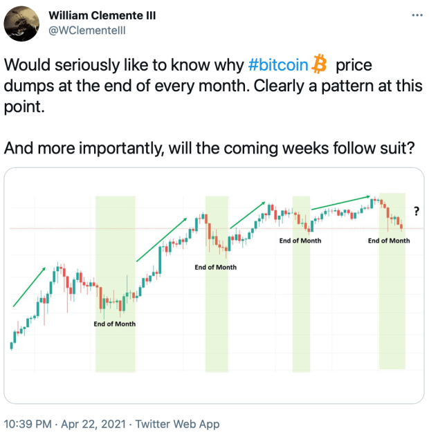
Upon writing my monthly market analyses, I noticed a trend: I am writing about a price dip that happened near the end of the month. William Clemente III has recently noticed that same pattern (figure 2).
1. Why Did We Dip (Again)?
Based on responses on Twitter, an explanation for this phenomenon should be sought in the options markets. As explained here, this is related to something called “max pain,” which is essentially the art of making one’s trading counterparty suffer the most to reach optimal personal profitability. After the bitcoin price had rapidly risen in late 2020, an increasing number of options traders were expecting continued price growth. This created a scenario in which it became profitable to take the other side of this trade if price indeed went down.
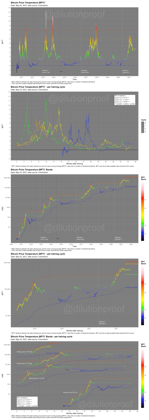
The rapid bitcoin price growth is particularly visible in the Bitcoin Price Temperature (BPT). As can be seen in the second chart in figure 3, temperatures rose at a much faster pace so far this cycle (orange line) in comparison to the previous one (yellow line). As a result, price reached temperatures of around six (orange line in the other charts in figure 3) at an earlier post-halving date than during the 2017 bull run. Therefore, some exhaustion of price could be expected around these price levels.
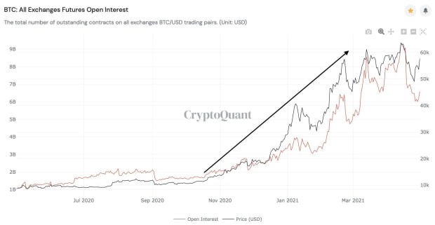
Similarly to the options markets, an increasing number of futures market participants became excited about bitcoin’s prospects and took leveraged bets at an increasing rate, causing open interest on futures to skyrocket (figure 4). Not just the bitcoin price and its temperature needed to cool off — so did the leverage in the futures markets.
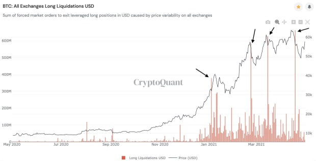
The amount of pain of those futures traders that massively went long on leverage during this parabolic rise is visualized in the long liquidations chart in figure 5. A lesson can be learned here: When everyone and their mother is going leveraged long, it pays to be short — especially if you are a whale that can help push the price down.
The latter is exactly what happened. The most recent bitcoin dip started with a large, somewhat old (August 2020) whale that took a profit (>400%), who was followed up by a younger (December 2020) whale that also took a profit (~100%), that cascaded all the way down to some newbie whales (<1 month old) that even ended up selling at a loss. I wrote a Twitter thread about this of which the first four tweets are summarized in figure 6.
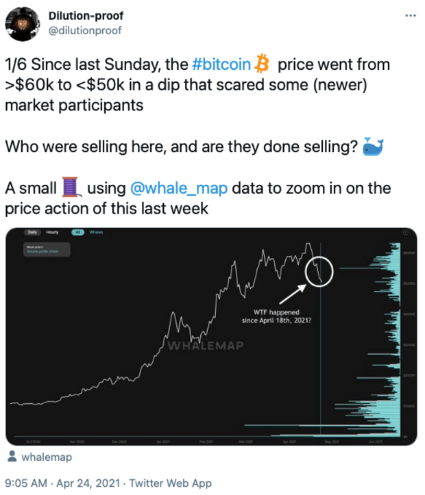
Figure 6: The first four tweets of a Twitter thread on whale profit-taking (Source).
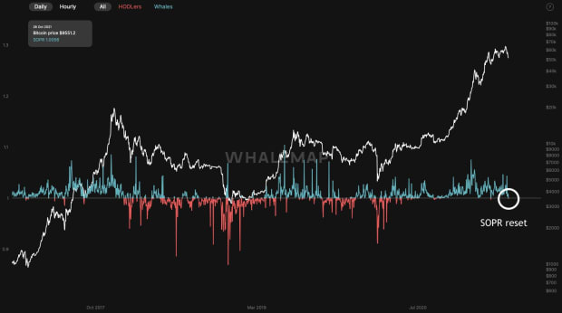
The thread concluded with a chart of the Spent Output Profit Ratio (SOPR) that had just reset back to one (figure 7). This means that, on average, the bitcoins that were last sold and moved on-chain were neither in profit nor at a loss — an indication that market participants are no longer actively taking profits, which is a good sign during a consolidating price dip.
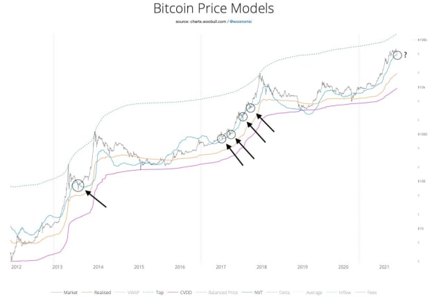
Around that same time, the bitcoin price was touching the Network Value to Transaction (NVT) ratio price model that had worked as a support during the previous bull runs (figure 8).
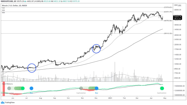
That week not just the bitcoin price dipped, so did its hash rate, likely thanks to a government-instituted power outage in China. This drop caused the hash ribbons to compress, creating a miner capitulation signal on the hash ribbon indicator. As soon as the hash rate starts to recover, the indicator then gives a “buy” signal (blue dots in figure 9) that can soon be expected to occur on the bitcoin price. Although it is unclear if the unique circumstances of this specific hash rate drop invalidate the signal, its miner capitulation and buy signals have historically been very good opportunities to buy bitcoin.
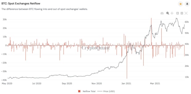
Since then, the bitcoin price bounced back resiliently, even closing the month at ~$57,800, which is barely even a red candle (-1.7%). What is encouraging, is that this rise was accompanied by some very negative net flows on spot exchanges (figure 10), possibly indicating continued institutional interest in the asset.
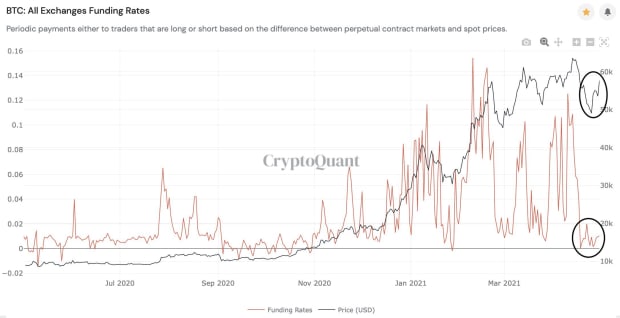
Perhaps an even more comforting thought is that this latest price rise was not accompanied by a rise in funding rates (figure 11), which is a sign that it was primarily spot-markets driven and more likely to be sustainable. This means that the traders that irresponsibly leveraged long during the run up and were rekt are now either on the sidelines or learned their lesson and bought spot bitcoin without leverage.
To gauge the current market sentiment, I held a Twitter poll last week. Although the sample size was modest, the results were quite clear (figure 12): Respondents were indifferent short-term but very much bullish on bitcoin mid- to long-term.
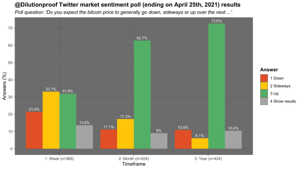
The previous 10 charts showed a clear picture that, during the last few months, bitcoin markets were (over)leveraged after a rapid price rise and simply needed a bit of time to cool off, causing this consolidation with several dips. To get out of a dip, you clearly need demand for the asset though, which brings us to the second question.
2. Is There Still Demand For Bitcoin?
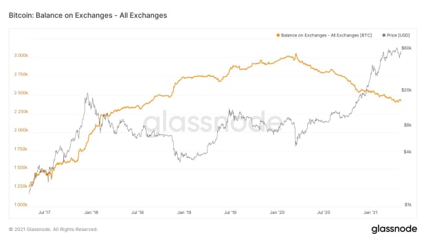
To assess this, we will have a look at the trends in a number of different metrics. Perhaps the exchange balances chart that has been in an incredible downtrend since the March 2020 COVID-19–related market panic is the most famous. Figure 13 shows that, although that downtrend has had a few minor bumps along the way, its larger trend is still intact.
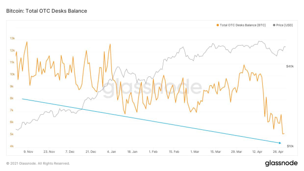
A similar pattern can be witnessed in the balances of Over-The-Counter (OTC) trading desks (figure 14). The supply shortage is real; there is a decreasing amount of bitcoin that actively circulates on the markets.
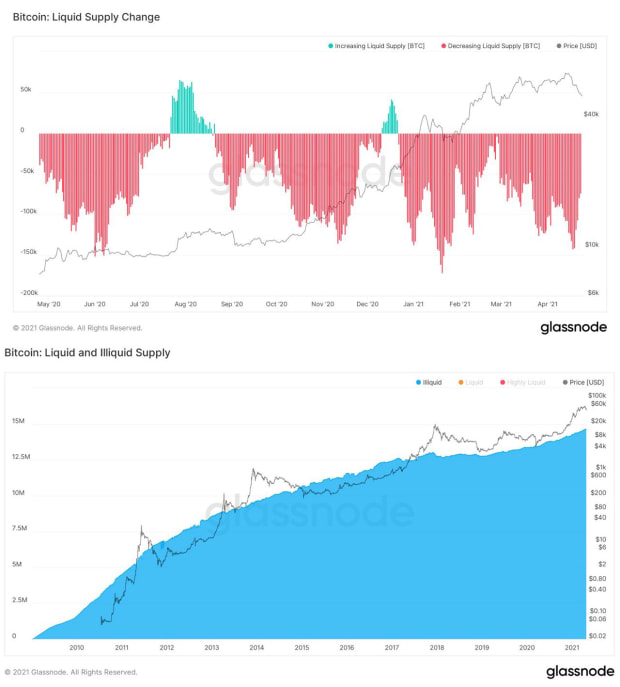
That trend becomes even clearer when you see that the liquid market supply has decreased on a daily basis all year so far (top chart in figure 15) and thus the illiquid supply — the coins in the hands of holders with no history of selling — keeps growing (bottom chart in figure 15).
A similar pattern can be witnessed when looking at miner positions. Miners were taking profits in January but have stopped doing so since late March and have been accumulating bitcoin ever since (figure 16).

If there is an increasing supply shortage on the markets, and newly created coins are not coming to market to fill it, who will?
The answer is clear: Existing coins need to become available to the market to meet the new demand. The problem is that long-term holders are not selling — they are buying (figure 17)!
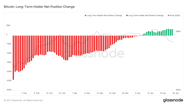
Since neither miners nor long-term holders are selling their bitcoin and balances on exchanges are declining, an increasing number of addresses on the Bitcoin network is in accumulation mode, as can be seen in figure 18.
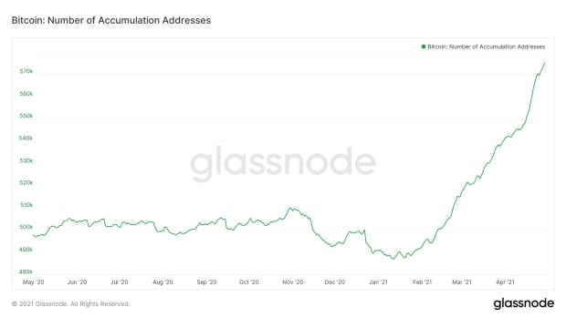
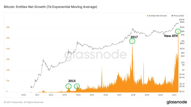
The steep rise in the number of accumulation addresses is even more encouraging when we consider that the number of new entities coming to the network is also growing at an all-time high (figure 19).
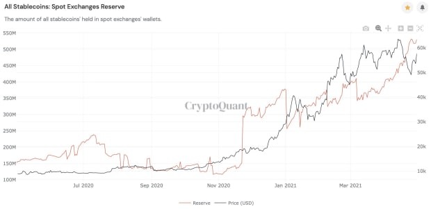
The previous charts are all observing historical data, but the relatively high stablecoin balances on exchanges in figure 20 suggests that that there could currently be money waiting on the sidelines, ready to buy the next dip — or perhaps FOMO in if price runs away.
These charts all suggest that the trends that signaled a high demand for bitcoin in the past are still present.
3. Is There Still Room For Growth?
It is hard to predict future demand for any asset, but the fact that bitcoin has moved in a very expressive four-year cycle (which I described in detail in this recent Bitcoin Magazine article) means that there is clear cyclical historic data to compare the current cycle with.
One of these metrics is the Market-Value-to-Realized-Value (MVRV) ratio, that compares bitcoin’s current market valuation to the value of all individual unspent transactions on the network at the last time they moved on-chain — the realized value. Like we saw with the BPT before, the MVRV (Z-score) reached relatively high levels recently, but since then it has dropped because the realized value itself went up (figure 21). The current cycle also did not reach similar MVRV Z-score levels as it did during the previous cycles, suggesting that if this cycle is like the others, there still is room for growth.

Similarly, the Puell Multiple — a metric that quantifies to what extent the daily coin issuance is increased in compared to its one-year moving average — was also at relatively high levels but recently decreased after the hash rate drop on the network (figure 22).

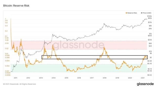
When we shift our attention to the confidence of long-term holders which is captured by the Reserve Risk, the results are less pronounced. The Reserve Risk suggests that, while long-term holders have gradually started taking some profits throughout the bull market so far, we are only halfway through the cycle in comparison to the previous cycles.
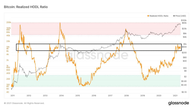
Where the Reserve Risk assesses long-term holder market behavior by looking at the age of the coins that were moved on-chain, the Realized HODL (RHODL) ratio does so by looking at the age of the long-term holders’ coins that didn’t move on-chain (figure 24). The conclusion is similar nonetheless: Compared to previous cycles, a relatively large portion of long-term holders are still keeping their cards against their chests, waiting for higher prices to part with their bitcoin.
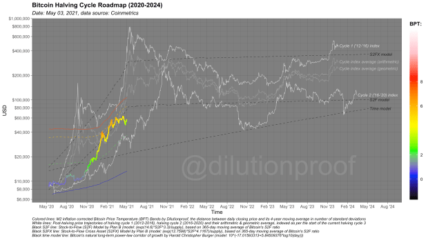
To close off this analysis, we’ll have a look at my Halving Cycle Roadmap chart (figure 25), that combines the BPT (Bands) metric that was introduced earlier with several popular predictive price models. By doing so, we get a rough idea where the bitcoin price might be heading next — off course, assuming that its four-year cyclicality holds. As the BPT recently cooled off toward green, the bitcoin price is now lagging behind most of the predictive price models. (When) will it catch up?
To finalize this market analysis, several conclusions can be summarized:
- Compared to the previous bull run of 2017, the price increase in this current bull run was relatively steep and intense, so some exhaustion could be expected at these levels.
- The bitcoin futures markets were (over)leveraged but now less so.
- The demand for bitcoin appears to be strong as ever.
- Under the assumption of four-year price cyclicality, there is still room for growth left on most on-chain market cycle metrics.
Disclaimer: This article was written for informational purposes only and should not be taken as investment advice.
This is a guest post by Dilution-proof. Opinions expressed are entirely their own and do not necessarily reflect those of BTC, Inc. or Bitcoin Magazine.


